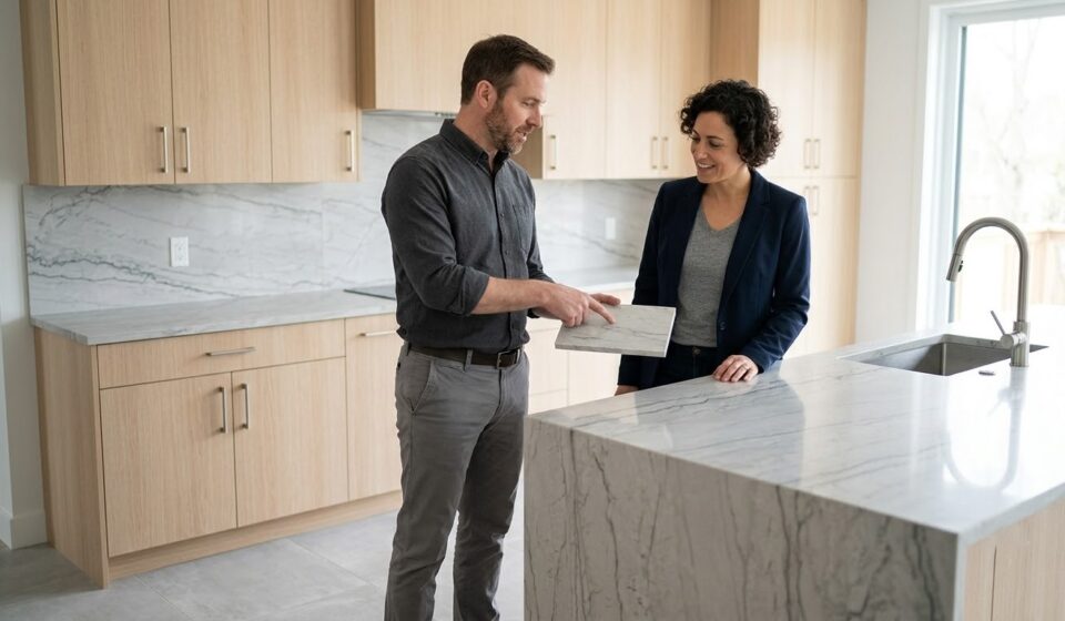


A well-designed interior is rarely about choosing one beautiful material. The real challenge lies in making cabinets, flooring, porcelain surfaces, fixtures, lighting, and furniture work together as one visual composition. Porcelain slabs can become a major design element in this process because their expansive formats, varied patterns, textures, and finishes allow designers to create strong focal points while maintaining visual continuity.
Coordinating a porcelain slab with the surrounding elements requires more than matching colors. Designers should consider undertones, texture, pattern scale, lighting, proportions, and the function of each surface. A dramatic slab may need understated cabinetry, while a simple porcelain surface can provide the perfect background for expressive fixtures or statement furniture. With thoughtful planning, these elements can complement rather than compete with one another.
Why Coordination Matters in Interior Design
Every visible surface contributes to the personality of a room. Cabinets establish structure, flooring creates the foundation, fixtures introduce functional details, and porcelain slabs can add texture and visual character.
When these elements clash, even high-quality materials can make a space feel disconnected. When they complement each other, the interior feels intentional and balanced.
Good coordination can help create:
- A unified color palette
- Better visual flow
- Stronger focal points
- Balanced proportions
- Greater design consistency
- A sophisticated overall appearance
The objective is not to make every element identical. Instead, designers should create relationships between materials through color, contrast, texture, scale, and repetition.
Start With the Porcelain Slab
One effective approach is to select the porcelain slab early, especially when the slab contains strong veining, dramatic movement, or a distinctive texture.
Identify the Dominant Colors
Examine the primary and secondary colors within the slab. A marble-inspired surface, for example, may contain a dominant white or beige background with grey, brown, or darker veins.
The dominant tone can influence cabinetry and flooring, while secondary tones can inspire smaller details such as handles, fixtures, lighting, or decorative accessories.
Understand Undertones
Two surfaces may both appear neutral but still have different undertones.
Warm beige, cream, and taupe surfaces generally work naturally with warm wood tones and brass-inspired fixtures. Cooler whites and greys can complement contemporary cabinetry, stainless steel, black fixtures, and cooler flooring.
Identifying undertones before purchasing materials can prevent unwanted color clashes.
Coordinating Porcelain Slabs With Cabinets
Cabinetry usually occupies a significant visual area, particularly in kitchens. The relationship between cabinets and porcelain surfaces therefore deserves careful attention.
Match or Contrast?
You can coordinate cabinets with porcelain slabs in two primary ways: matching or contrasting.
A matching approach uses related tones to create a calm, continuous interior. For example, light cabinetry paired with a soft stone-inspired slab can create an understated appearance.
A contrasting approach creates stronger visual definition. Dark cabinets paired with a light porcelain surface can establish a dramatic focal point.
Neither approach is automatically better. The choice should reflect the desired atmosphere and the amount of visual contrast already present in the room.
Consider Wood Cabinetry
Natural or wood-look cabinetry introduces warmth and texture. When paired with a heavily patterned slab, the combination can become visually busy.
A simpler porcelain surface can allow wood grain to remain prominent. Conversely, a restrained wood tone can provide balance when the porcelain slab contains dramatic veining.
Coordinating Porcelain Slabs With Flooring
Flooring creates the visual foundation of a room, so it should complement rather than compete with the slab.
Create a Balanced Relationship
If the porcelain slab has a strong pattern, consider a more restrained floor. A subtle concrete, stone, or neutral floor can allow the slab to become the primary feature.
If the slab has a simple texture, designers can introduce more character through flooring patterns or natural wood tones.
Consider Continuity
Using related tones between the slab and floor can create a connected appearance. The surfaces do not need to match exactly. Instead, they should share at least one visual characteristic, such as a warm undertone, neutral base, or complementary texture.
This approach can make open-plan interiors feel more cohesive.
Coordinating Fixtures With Porcelain Surfaces
Fixtures may occupy less surface area than cabinets or flooring, but they can strongly influence the final appearance.
Metal Finishes
Common fixture finishes include:
- Chrome
- Brushed steel
- Matte black
- Brass
- Bronze
- Gold-toned finishes
The chosen finish should relate to the colors and undertones of the porcelain surface and surrounding materials.
For example, warm porcelain tones can work well with brass or bronze details, while cooler grey surfaces can complement chrome, steel, or matte black fixtures.
Avoid Excessive Finishes
Using too many metal finishes can make a room feel visually fragmented. A consistent fixture finish across handles, taps, lighting, and accessories can create a stronger sense of unity.
How to Coordinate Colors Without Making the Space Look Flat
Matching every surface may seem safe, but excessive coordination can make an interior feel monotonous.
Use the 60-30-10 Principle
A useful design approach is to divide the visual palette approximately into:
- 60% dominant color or material
- 30% secondary color or material
- 10% accent color
For example, a room could use neutral flooring and walls as the dominant foundation, contrasting cabinetry as the secondary element, and metallic fixtures or decorative details as accents.
This creates hierarchy without forcing every surface to look identical.
Coordinating Porcelain Slabs With Kitchen Design
Kitchens require particularly careful coordination because several materials meet within a relatively compact space.
The countertop, backsplash, cabinets, flooring, appliances, handles, and lighting all contribute to the overall composition.
A large-format porcelain surface can become the visual bridge between these elements. For example, a slab can coordinate with the cabinet color while introducing a subtle contrast through veining or texture.
A dramatic slab can also serve as the central focal point, with simpler cabinetry and flooring providing visual balance.
Coordinating Porcelain Slabs in Bathrooms
Bathrooms offer another opportunity to build a coordinated material palette.
A large porcelain surface can connect walls, vanity areas, shower sections, and other architectural elements. Designers can select flooring that complements the slab without duplicating its exact pattern.
Fixtures should then reinforce the chosen palette. For example, dark hardware can create definition against light porcelain, while warm metallic fixtures can introduce softness into neutral interiors.
Extending the Design to Outdoor Areas
Modern architecture increasingly creates visual relationships between indoor and outdoor spaces. When the project includes terraces, patios, balconies, or exterior features, designers can select materials that relate visually to the interior.
Suitable porcelain outdoor slabs can help extend a coordinated material concept into selected exterior applications. Product specifications, environmental conditions, installation methods, and intended use should always be evaluated before selecting an outdoor surface.
Choosing the Right Porcelain Surface
Selecting the right porcelain slab involves more than choosing a color from a catalogue.
Consider:
- Pattern Scale: Large patterns can become dramatic focal points, while subtle patterns work well as backgrounds.
- Finish: Different finishes can change how light interacts with the surface and influence the overall atmosphere.
- Format: Large formats can create broader visual planes, while smaller formats may suit detailed or complex applications.
- Application: Always select a product appropriate for its intended use, whether it involves walls, floors, countertops, bathrooms, or other architectural applications.
Working with an experienced porcelain tile manufacturer can also help professionals understand product specifications, available formats, finishes, and suitable applications.
How Lioli Ceramica Supports Coordinated Interiors
Lioli Ceramica offers large-format porcelain surfaces for residential, commercial, and architectural projects. Its collection includes varied designs, textures, formats, and finishes that allow designers to develop coordinated material palettes.
These surfaces can complement kitchens, bathrooms, living rooms, bedrooms, feature walls, floors, countertops, and other applications. By combining expansive formats with contemporary designs, Lioli Ceramica provides architects, designers, contractors, and homeowners with options for creating interiors where different materials work together rather than compete.
Frequently Asked Questions
Should cabinets match porcelain slabs?
Cabinets do not need to match the slab exactly. Designers can use complementary or contrasting colors to establish visual balance.
Should flooring be lighter or darker than the porcelain slab?
Either approach can work. A darker floor can ground a light slab, while a lighter floor can create an airy appearance. The decision depends on the room’s lighting, dimensions, and overall palette.
How many colors should an interior use?
A restrained palette often creates a more cohesive appearance. Designers can use dominant, secondary, and accent colors rather than introducing numerous unrelated shades.
Can the same porcelain slab be used on multiple surfaces?
Yes, when the selected product is suitable for each intended application. Using related surfaces across countertops, walls, or other areas can strengthen visual continuity.
How do I coordinate metal fixtures with porcelain?
Look at the porcelain’s undertones and pattern colors. Warm surfaces can complement warm metallic finishes, while cool surfaces often work well with steel, chrome, or darker finishes.
Can porcelain surfaces connect indoor and outdoor designs?
Yes, suitable products can help create a visual relationship between indoor and outdoor areas. The selected product must meet the requirements of the intended exterior application.
Conclusion
Coordinating porcelain slabs with cabinets, flooring, and fixtures requires a balanced approach to color, texture, pattern, scale, and proportion. Rather than making every material identical, designers can create stronger interiors by establishing visual relationships between different surfaces. A carefully selected porcelain slab can become the central element that connects cabinetry, flooring, fixtures, lighting, and furniture into one cohesive design.
Lioli Ceramica offers versatile large-format porcelain surfaces that can support coordinated residential, commercial, and architectural interiors. With a variety of designs, textures, formats, and finishes, Lioli Ceramica gives architects, interior designers, contractors, and homeowners the flexibility to develop distinctive kitchens, bathrooms, living rooms, bedrooms, and feature spaces. The right combination of surfaces can create an interior that feels balanced, contemporary, and thoughtfully designed.